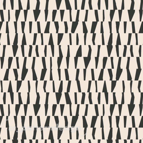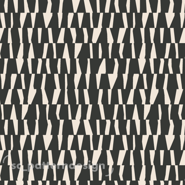
Here a pattern study of positive vs negative options using one same identical pattern and shapes. I love how shadows and highlights radically influence the mood. When we explore a design through positive and negative color schemes, we unlock a whole new dimension of its potential.
Which version is more appealing for you? The lighter more energetic and vibrant or the darker more dramatic and moody?